Scholar OneSearch
Re-skinning Northeastern University Libraries' Primo UI

Why such a drastic change in design?
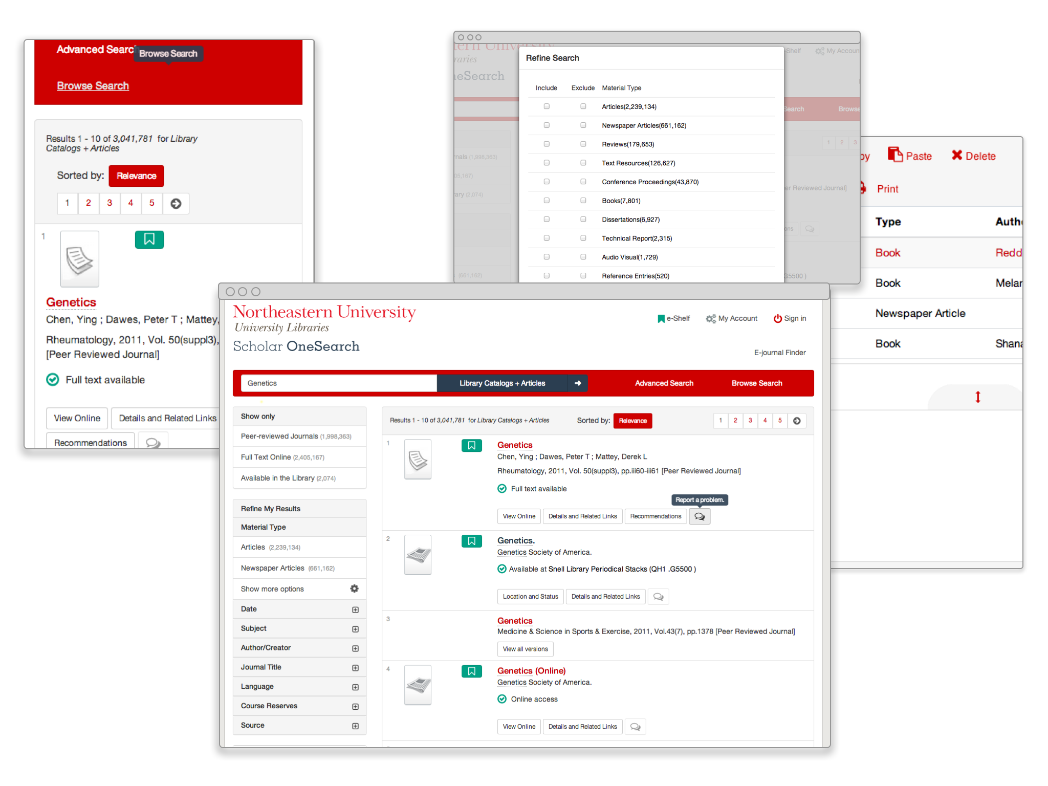
With the launch of Alma on July 1, 2013, Northeastern University Libraries introduced the new Scholar OneSearch, a Primo installation featuring responsive and user-friendly design.
We're especially proud of our responsive design, which allows flexibility and functionality beyond the default mobile stylesheet. We're also happy to have WorldCat NRE requests integrated successfully.
Scholar OneSearch also improves upon some of the features in the standard Primo release, including a reorganized page header, collapsing facets in the left-hand “refine” navigation, and integrated feedback into each search result.
Constraints of default design
The default front-end, the html, javascript and CSS delivered to the browser, greatly limited the amount of customization. In our first early implementation. We only authored a few lines of code to override the default design. Through our user testing we identified that we might need to take a drastic overhaul of the CSS. While starting the design process the decision to include the original CSS at all was heavily weighed in, since the default CSS took a great amount of specificity in the CSS selectors to override. We have implement this first design with the inclusion for the reasoning of avoiding the possible issues of not having any fallback for unforeseen and tested features where there was no CSS and left the user with a non-functioning design.
Leveraging Open-Source Technology
With the relative short deadline before release, it would have been nearly impossible drastically change the user-experience without the help of open-source projects. We implemented from the Front-End framework from Twitter called Bootstrap. The project was customized through using the project's preferred CSS preprocessor LESS. Without the aid of a CSS Preprocessor the stylesheets would have been unmaintainable and the complex CSS selectors would have been nearly impossible. Recess was used to help enhance LESS by compiling and ordering the CSS with best practices automatically, can be used as a fantastic CSS linting tool as well.
// LESS before being compiled to CSS

.navbar-toggle{
  background-color: @navbar-toggle-bg;
  border: @navbar-toggle-color 3px solid;
  .icon-bar{
    background-color: @navbar-toggle-color;
  }
  border-color: @navbar-toggle-color;
  &:hover,
  &:focus{
    background-color: @navbar-toggle-bg-hover;
  }
}
Compiled to
/**  Becomes **/


.navbar-toggle {
  background-color: #ffffff FF;
  border: #cc0000 3px solid;
  border-color: #cc0000;
}

.navbar-toggle .icon-bar {
  background-color: #cc0000;
}

.navbar-toggle:hover,
.navbar-toggle:focus {
  background-color: #555555;
}

.navbar-brand {
  max-width: 250px;
}
With the use of the Font-Awesome icon font set, we were able to create retina ready icons that are small in size and can be styled with the power of CSS. The project includes LESS stylesheets and powerful mix-ins. Inspiration and color pallets were taken from the popular Flat-UI project and were integrated into the Bootstrap framework. Modernizr was used for feature detection and filling in gaps in legacy browsers.
Further modifications were made to the HTML through the use of jQuery. The jQuery was already included with Primo. We built our javascript functions in "The Module Pattern" to help organize the code if it increases in complexity. Although modifying the DOM too heavily with javascript is not a best practice, the restraints of working on someone else's application gave no other option.
Projects Used
- jQuery
- twitter/bootstrap
- twitter/recess
- Font-Awesome/Font-Awesome
- design-modo/Flat-UI
- Grunt.js
Working together for a better Primo
The Northeastern Libraries wants to continue to make Primo and Scholar OneSearch better through collaboration with others in the Primo user community. This means making the code available for you to use with Primo at your library. Even though we there is more work that needs to be done, we are following the "Release early, and release often" iterative approach. If you are interested in implementing this code, please help contribute back improvements. Even submitting and fixing issues that you have found in a copy of the code would be beneficial to any adopting institutions. You can view and work on the code through our public repository at nu-lts/scholar-onesearch.
Ways to contribute
- Adding documentation to the wiki.
- Filing issues and enhancement request
- or even just using that for feedback / suggestions.
- Fixing and adding new features through a pull-request.