Bookshare
Making access to an online accessible library easier.
Bookshare was one of the more challenging projects I had worked on at that point, but the work was ultimately very rewarding because of the impact we were able to make on helping the organization reach the users that needed their help in accessing materials that helped individuals with print based disabilities.
I was involved in the discovery and frontend implementation of their new CMS. The project had to be responsive, easy to use and most importantly accessible by any user.
The biggest take-away from the project was the absolute need for user-testing by individuals with different accesss needs. Making assumptions about what is best practice ultimately proved to often be misguided.
Going into the project thinking that using the WAI-ARIA specifications to describe the visual interactions of the CMS actually created an awkward experience for what many users of Assistive Technology (AT) were expecting. That ultimately using more traditional and expected patterns were the best solutions.
The best example might be how we implemented a menu system for the navigation bar for the site. For example a simple list of links around a <nav> tag would have been much better than something more complex like the example below. Finding out that we were spending more time trying to use every ARIA role to describe the markup was ultimately, not helpful, but using a more traditional <ul> to markup the menu.
<nav role="navigation">
  <a class="brand">Bookshare</a>
  <h2 class="sr-only">Main Menu</h2>
  <ul class="nav" role="menu">
    <li role="presentation">
      <a href="explore" role="menuitem">Expoore</a>
      <a href="#exploreDropdown" role="button" class="dropdown-toggle"
        aria-haspopup="true" aria-expaned="false" id="exploreDropdownToggle">
        <span class="caret" aria-hidden="true"></span>
        <span class="sr-only">Expand dropdown menu for Explore</span>
      </a>
      <ul class="dropdown-menu" role="menu" id="exploreDropdown"
        aria-describedby="exploreDropdownToggle">
        <li role="presentation">
          <a href="/explore/books" role="menuitem">Books</a>
        </li>
        <li role="presentation">
          <a href="/explore/articles" role="menuitem">Articles</a>
        </li>
      </ul>
    </li>
  </ul>
</nav>
Simple things like providing guidelines to using a good heading structure was extremly useful. Simply trying using voiceover to navigate your work was a very helpful, and humbling, experience to quickly fix some of the more obvious issues.
These lessons were later used to help contribute back to our theme, Kalatheme, to make it more accessible and thus the many sites that use it or will in the future.
This project was using kalatheme, which uses Bootstrap, so began our assement of the framework's accessibility. Bootstrap, love it or hate it, has been wildly successful and has become the most popular web UI framework. Working on this project, made me realize that documentation and many of the plugins had a lot of room for improving accessibility. I was able to work on a few commits on the project that were later added in a recent release. It was pretty rewarding to get to work on a project that I have been using for years and see that I have the chops to contribute.
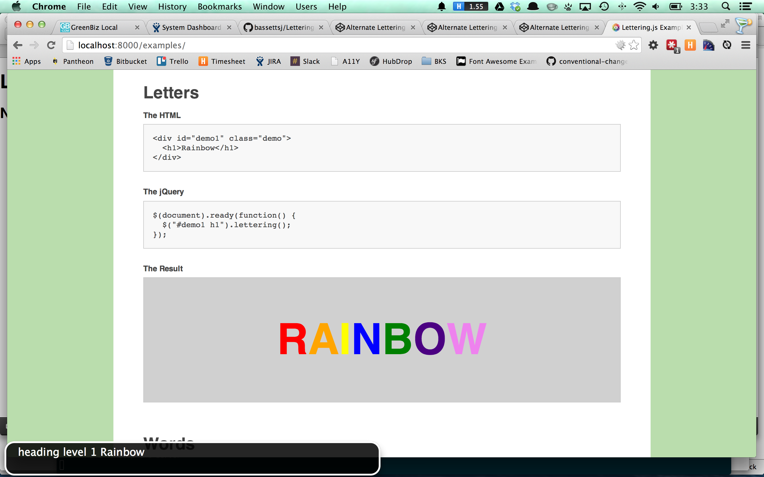
The project also was using the FitText.js, a jQuery plugin to make larger header text scale up or down to fit the container's size. It uses Lettering.js to do this by simply wraping each letter in a new span tag so CSS can target each letter specifically. The result though for screenreader users isn't great. Each span is treated as a seperate word and a pause is given, thus a heading with "Title" would be annouced as "T, I, T, L, E" with a pause for each letter. Not great, I went to open an issue with Dave Rupert, the author, and saw he was already trying to work on it. His solution provided a copied element, that was shoved off screen but still accessible to the screen reader and then the modified original was given a aria-hidden="true" attribute. Dave wasn't super satisfied with the result because it resulted in duplicate content, that could effect SEO. I was wondering is an aria-label attribute would achieve the same results and prevent duplicating elements. I created a new pull request and it was accepted, I was pretty psyched on that one. I have looked up to Dave for a while on a great leader in frontend web development. He was a co-host on the shoptalk show and often speaks at conferences.

more to come...